Responsive Web App

I. Research & Competitive analysis
In doing a competitive analysis, I looked at a both direct and indirect competitors. They fell into the following buckets:
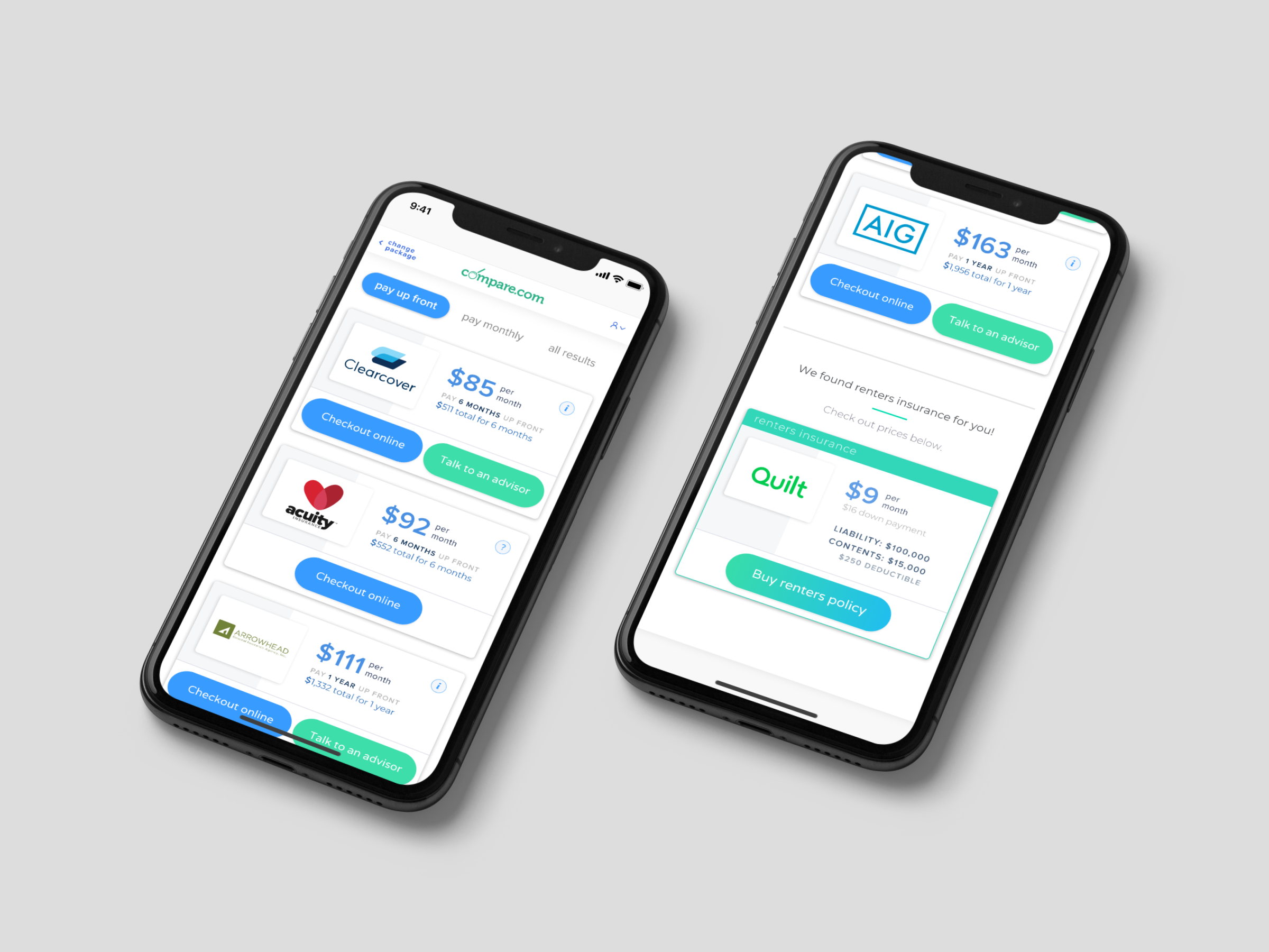
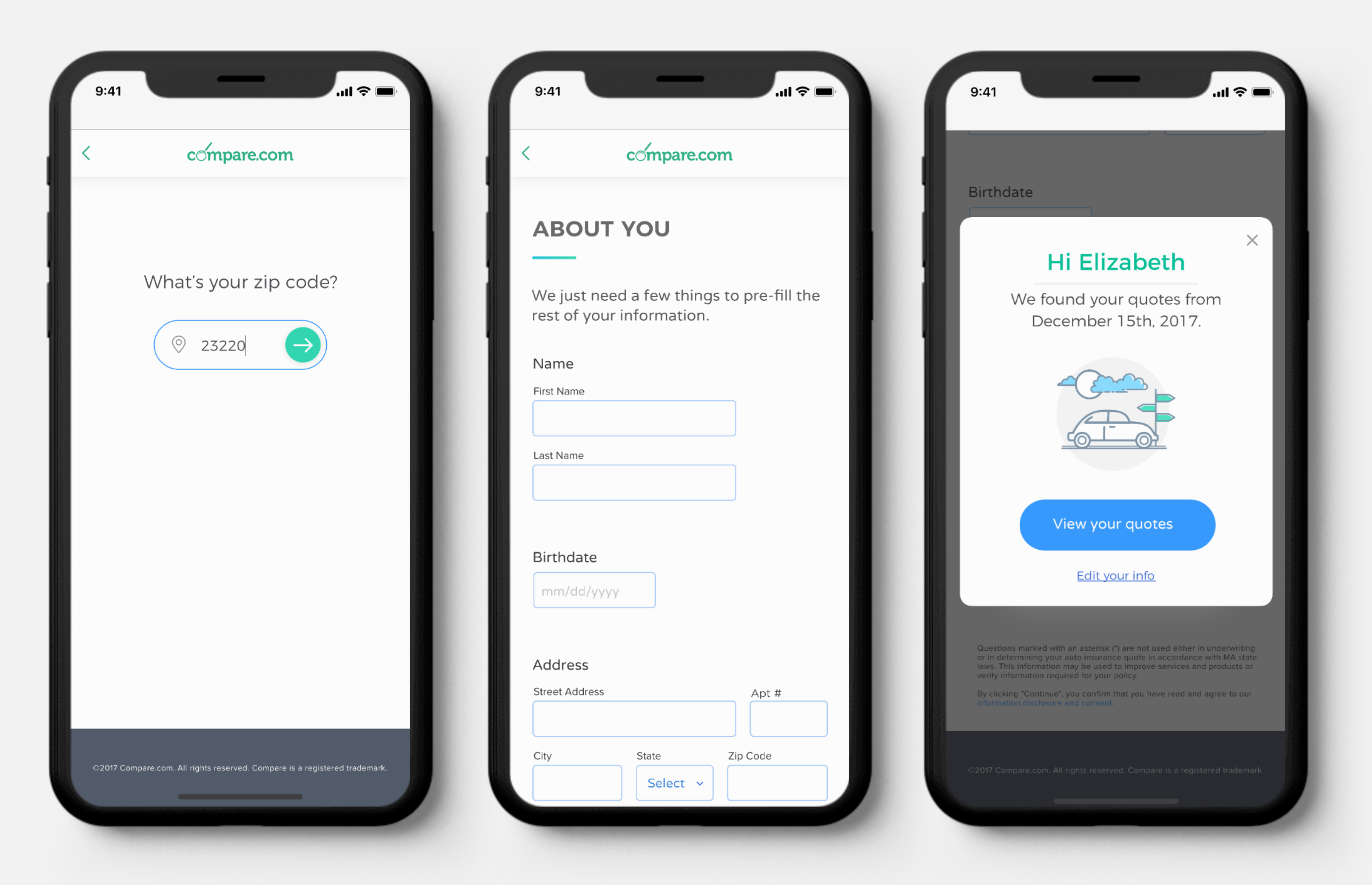
- Companies that provided users with auto insurance quotes from a variety of carriers (most direct competition)
- Auto insurance carriers with their own online quote process
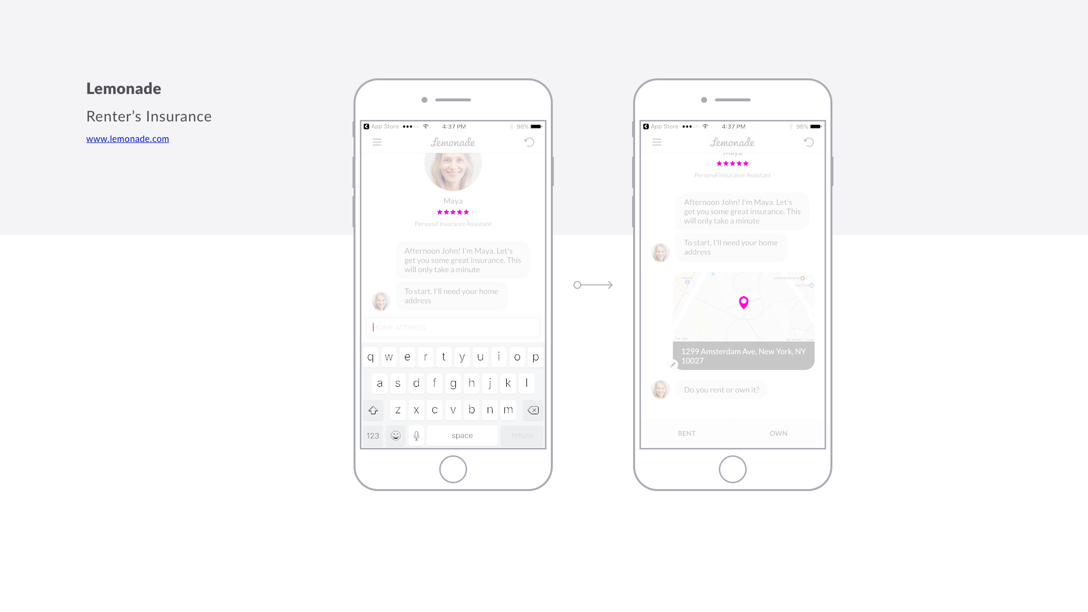
- Companies/carriers that returned quotes for other types of insurance (ex. renter's insurance)


Findings
- Both direct and indirect competitors had a visual style and voice and tone that appealed to younger, more tech-oriented audiences: brighter colors; large, full-screen images; a friendly, conversational tone; use of iconography and illustrations throughout the customer journey
- Several competitors were using non-traditional form interfaces. One of these was a Conversational UI, in which form questions are formatted to look somewhat like a chat conversation, but is not an actual chatbot. Another direct competitor offered an actual chatbot via Facebook Messenger in which customers could answer the same questions that they would on the online tool and view their quotes within a Facebook chat window.
- Companies who had non-traditional form interfaces often offered them in addition to a more traditional form. Users could choose how they wanted to get their quote.
- Many companies were taking advantage of new(ish) technologies to improve user experience. For example one app would look up your vehicle information if you took a photo of your Driver's License.
II. Prototypes, User testing, Iterating & More Testing
8
Prototypes
30
Testing Rounds
117
Test Participants
The processes of prototyping, user testing, developing a visual style, and re-structuring the order of the questions happened in tandem feedback from each round of user tests influenced each iteration.
We used UserTesting.com to conduct 3 types of tests: live tests moderated by a member of the compare.com team, live tests moderated by a UserTesting.com professional, and recorded tests that testers did on their own time. We always had users speak their thoughts out-loud, and answer specific questions. In many cases we asked participants to fill out the both the current online form and then the same fields on a prototype form, and we switched the order for half of the participants in each round.
Between June 1st and August 24th, 2017 we conducted 30 rounds of of user tests with a total of 117 participants.
From our initial research we had identified four concepts we wanted to explore and test through prototyping:
- Conversational UI
- Driver's License Photo OCR - Using Driver's License photos to pre-fill users information using Optical Character Recognition (OCR)
- One Question Per Page - Displaying only one question at a time, one on each page, and auto-advancing users to the next page when possible
- Simplified Traditional - A more "traditional" form with just a few questions per page and use of iconography
Our testing and prototype creation and iteration process, if mapped out, would be a web with arrows going in all directions. We created the first prototype, ran the first round of tests, incorporated that feedback into a second iteration of the first prototype while also starting a second concept prototype—and so on.
Concepts #1 & #2 were the hardest to test. Here's what we came up with:
#1 - Conversational UI: I built a simple chatbot using motion.ai and smooch. Users understood that it was not "real" in that it was only set up to receive the pre-determined answers—the idea here was to simulate the experience of a conversational UI.
What we learned: The conversational UI had some advantages—the familiar interface meant users immediately knew how to interact with it. Users were pleased with the bot's persona, Megan, and felt this made the experience more pleasant and personal. But it became clear very quickly that there are functions available in traditional forms that users didn't know where to even begin to try to find in a chatbot: editing previous answers, and accessing help/hint text. Ultimately, user feedback was that the ability to edit previous answers and access help/hint text was too important to overlook, and the chat interface didn't offer a clear way to access these functions.
What we learned: The conversational UI had some advantages—the familiar interface meant users immediately knew how to interact with it. Users were pleased with the bot's persona, Megan, and felt this made the experience more pleasant and personal. But it became clear very quickly that there are functions available in traditional forms that users didn't know where to even begin to try to find in a chatbot: editing previous answers, and accessing help/hint text. Ultimately, user feedback was that the ability to edit previous answers and access help/hint text was too important to overlook, and the chat interface didn't offer a clear way to access these functions.

Screenshot of the chatbot I built to test our customer journey as a chat interface.
#2 - Driver's License Photo OCR: The idea here was that users would have the option to take a photo of their Driver's License in order to pre-fill some of their information. This, of course, was not possible to functionally prototype, so for this concept we simply asked participants whether they would use a feature like this
What we learned: What was interesting here was that when users were asked "Would you want to take a picture of your Driver's License to pre-fill some of your information?" most users answered "Yes." After investigating this concept further, we learned that this feature doesn't actually have any impact on pre-filling any of the vehicle information. The only info it can pre-fill for the user is name, address, and date of birth. (Once that is entered, either manually or via License photo, a hook into an additional database can look up vehicle information). So we conducted a second round of testing and asked users if they would rather (a) manually enter their name, address, and date of birth, or (b) take a photo of their Driver's License instead. In this case, the majority of users said they would rather enter these fields manually. Since that info would be sufficient to look up their vehicle information, we ruled out the Driver's License scan concept and focused on ways to personalize the customer experience and pre-filling users information whenever possible.
What we learned: What was interesting here was that when users were asked "Would you want to take a picture of your Driver's License to pre-fill some of your information?" most users answered "Yes." After investigating this concept further, we learned that this feature doesn't actually have any impact on pre-filling any of the vehicle information. The only info it can pre-fill for the user is name, address, and date of birth. (Once that is entered, either manually or via License photo, a hook into an additional database can look up vehicle information). So we conducted a second round of testing and asked users if they would rather (a) manually enter their name, address, and date of birth, or (b) take a photo of their Driver's License instead. In this case, the majority of users said they would rather enter these fields manually. Since that info would be sufficient to look up their vehicle information, we ruled out the Driver's License scan concept and focused on ways to personalize the customer experience and pre-filling users information whenever possible.
During the testing phase it became clear that concepts #3 (one question per page) and #4 (simplified traditional) were the front-runners. At the same time, we had been honing the visual design based on feedback from user testing, and had established a brighter, more vibrant color palette.
We began testing honing and testing the final two concept prototypes against each other, against competitors sites, and against the current customer journey. What it came down to was this:
#3 - One Question Per Page: People tended to favor the one-question-per-page format much more for shorter forms—10-15 questions or less. Once they surpassed that they started to get fatigued.
#4 - Simplified Traditional: When the number of questions per page ranged from 3-5, users were the most satisfied with the balance between the amount of information they saw at once vs. number of pages. It made them feel like they were making enough progress with each page, and allowed groups of similar questions to be grouped on the same page without the page being visually overwhelming. Users also expressed a need to be able to navigate easily between different sections of the form in both concepts, and the benefit of understanding their progress throughout the journey.
Design


With our conceptual testing completed, we took our concept and refined it—this meant a lot of things:
- Refining the visual design based on feedback: developing custom icons, incorporating brighter colors, choosing the right typography for the new tool
- Breaking out the question branches and finalizing the question flow with all possible dependencies (from a total of 112 possible questions)
- Diving into the UX of each question, each page, and the overall navigation
Getting it built
Okay, we did a lot of the design & UX up front before we joined up with the product developers, but when we kicked off with them our work was far from over. We got a huge head start on mocking up *most* of the journey, but we all dove into the weeds together in a two day kick-off meeting. It was my UX team and 4 product developers, all day for 2 days, and we took over a whole section of the office with post-its, whiteboards, markers, tape, stickers, snacks, and more post-its. I printed out all the designs we had up until that point, the product owner broke the project development into phases, and we gave each section of the wall a phase.

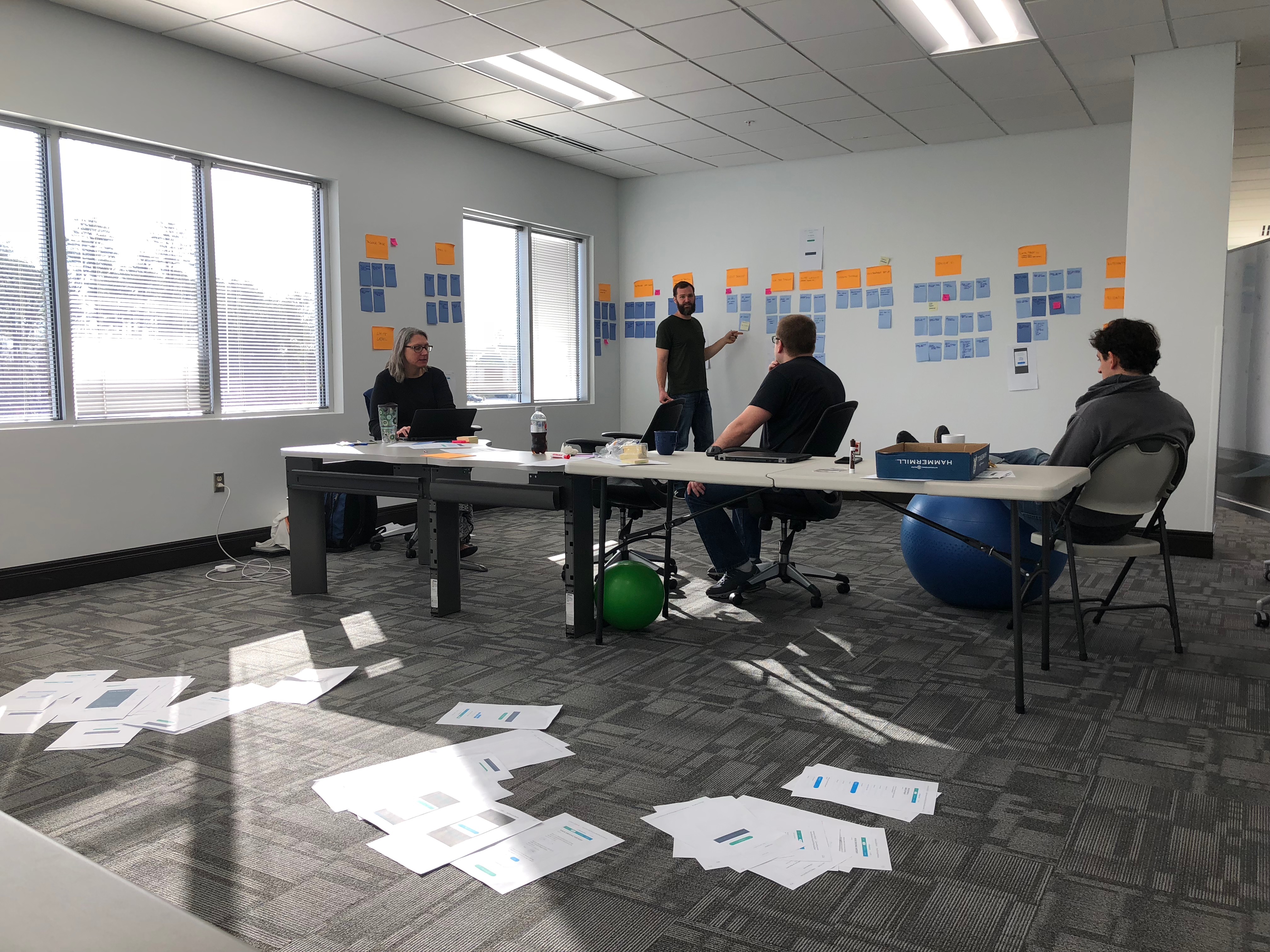


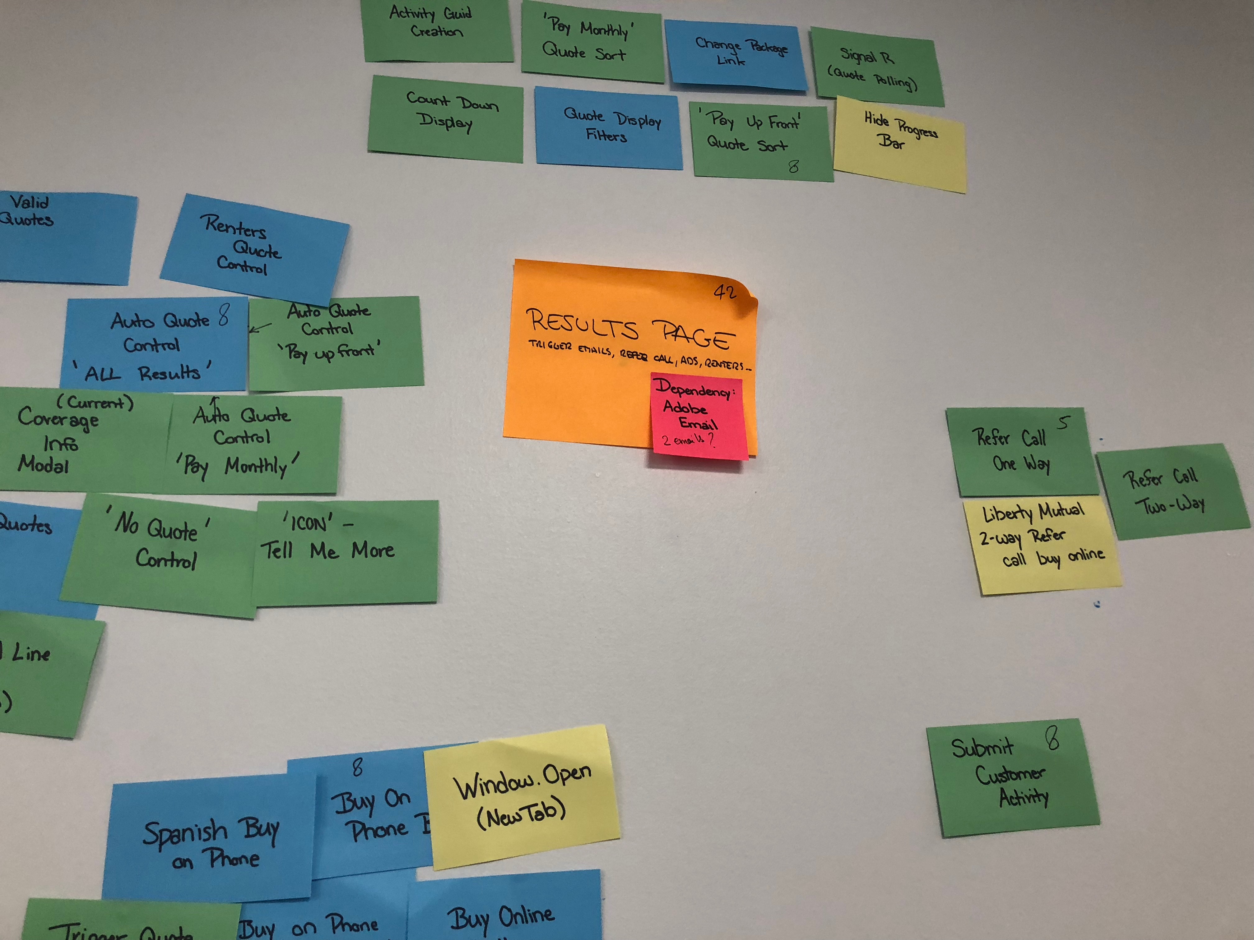


For some of the developers, this was the first time they were seeing the designs. This served as a project kickoff, but mostly we were trying to accomplish a few key things:
- Determine top-level requirements for each phase of the project and find dependencies between phases (What needed to be done before we could get started on XYZ?)
- Map out the project sprints
- Learn what additional designs and design functionality would need to be designed
After kickoff we moved in 2 weeks sprints. Starting off, the other designer and I worked with 4 developers on the structure of pages, elements, and controls so that we could do the CSS.
Implementation also included working with PO's to write requirements, working with an agency to establish brand guidelines for voice and tone, and coordinating an audit and re-write of all microcopy on the tool, working with QA teams on test cases, and refining development details like validation messages and animations.
This phase was my favorite—it took so much collaboration and teamwork from so many different areas of the company, and we felt good about what we were building. The user testing results had been shared company-wide, and even people who weren't directly involved with the project were excited to see what the user-centered tool would do for our customers.
REsults to come
The customer journey is scheduled to launch in fall of 2018. 🎉
In the meantime, here are the InVision Mockups.