There are 437,000 children in the US foster care system, and every year more than 23,000 children "age out" of the system without returning home or being adopted.
Think of Us App—Discovery Phase
Using affinity mapping and small group interviews to find out how the Think of Us app would fit into users lives

Background
Think of Us is a tech non-profit based in Richmond, Virginia with a mission to leverage technology to improve the outcomes of youth aging out of the foster care system.
I joined the team as Lead Designer in May 2018. My role on this specific project was to create and execute a test plan, analyze data, share insights, and work with external teams to incorporate findings into product strategy.
The Product
The first tech-driven platform for foster youth
Think of Us is a platform built for foster care youth that puts them "in the driver's seat." Young people can build their network of supporters, create goals, access resources, and work towards their goals with help and encouragement from their supporters.
The Problem
There was a gap in our understanding of how our prospective users would actually use the app in their daily lives.
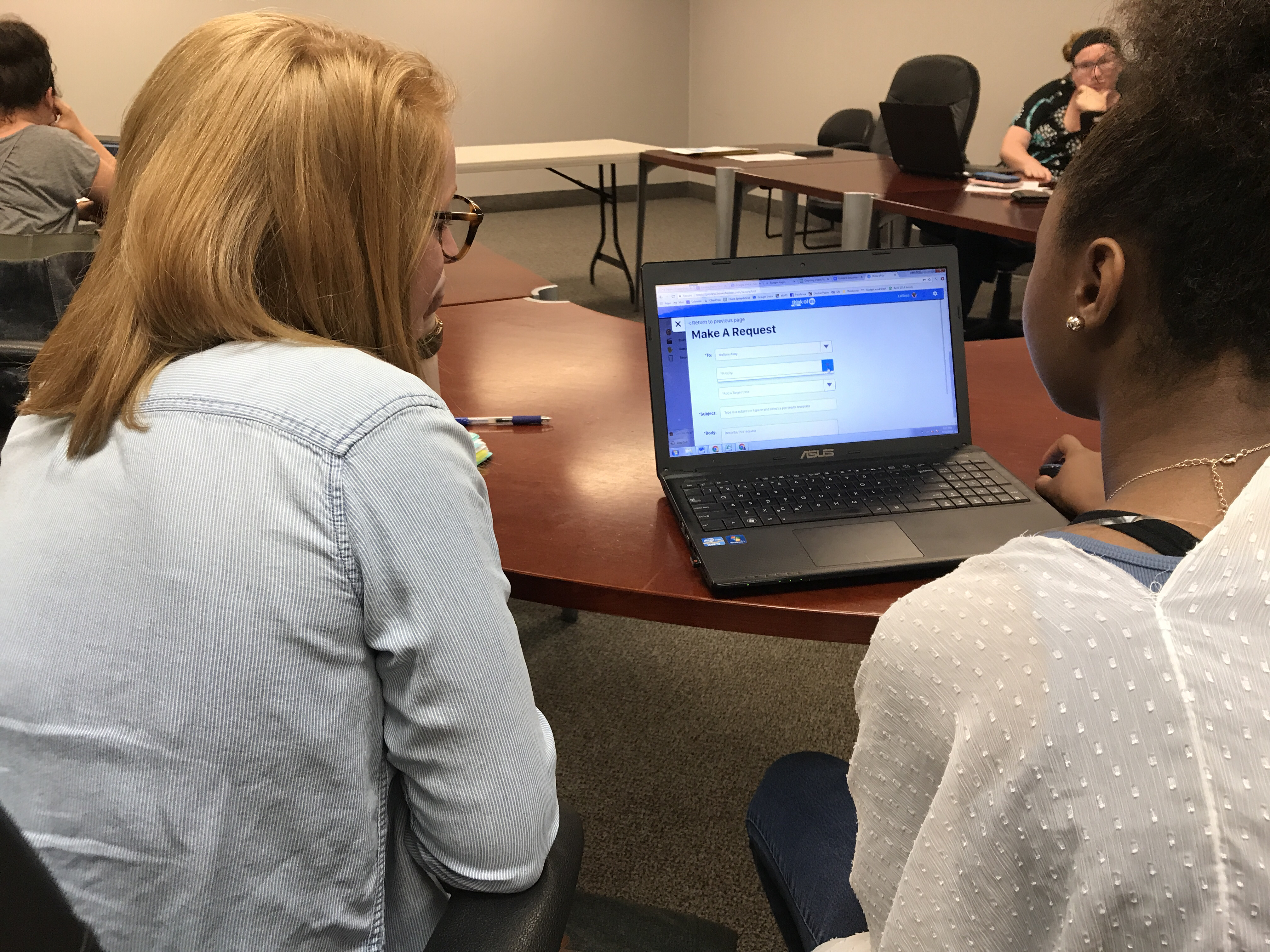
Previous testing of the TOU app was lab-based and task oriented. Users were seated at a laptop, were asked to perform specific tasks on the platform, and asked for their feedback.
While this was great to establish the products core functionality, we needed to get the product in front of users in a real environment to make sure we were solving the right problems.
Field testing would be the best methodology to help us shift our focus from features to outcomes at this stage, so I created and executed a test plan for a two-week field study.
Project Timeline
Notable inventions, 1910–2000
And future Call of Duty players would thank them.
Because every kid should get to be Tarzan for a day.
And the world rejoiced.
Because building roads is inconvenient.
Ain’t nobody got time to rake.
Because paper currency is for noobs.
Nobody likes cords. Nobody.
Brighter than glow memory.
To capitalize on an as-yet nascent market for cat photos.
Because organic search rankings take work.
Project Timeline
Project KO, May 7th - Site-Wide Platform Launch July 13th
Week 1: Draft project proposal and present to board
Week 2: Present project plan to test sites in Omaha, NE and Santa Clara, CA
Weeks 3-5: Conduct field testing at test sites in Omaha, NE and Santa Clara, CA with 15-20 test users.
Week 6-7: Distill user testing insights, transcribe interviews and organize research findings
Week 8: Present findings to Executive Team, Board, and Product Teams
Week 9: Plan further implementation/prioritization of research findings; Begin launch strategy planning
Week 10-12: Work with Program & Practice to finalize launch strategy and create Launch Toolkit for site staff
Objectives & Key Results
Qualitative research often brings up learnings you couldn't have planned for—but as a starting off point, I outlined the following objectives:
- Define pain points throughout the user experience when using the platform
- Identify opportunities for improvement based on specific user goals, needs and values
- Gain a deeper understanding on the role environmental factors play in impacting user experience and overall engagement for specific user groups
Creating a Test Plan
I worked closely with our Director of Program and Practice, Aisha van Ter Sluis, to refine the plan for two audiences: our board and stakeholders at our two testing sites 1) Project Everlast in Omaha, Nebraska and 2) The Hub in Santa Clara, California.
Both locations were social service agencies that employed social workers, serving as case managers for youth in the foster care system. On-site interaction with youth and case managers would take place at each agency in a meeting room or flex space.
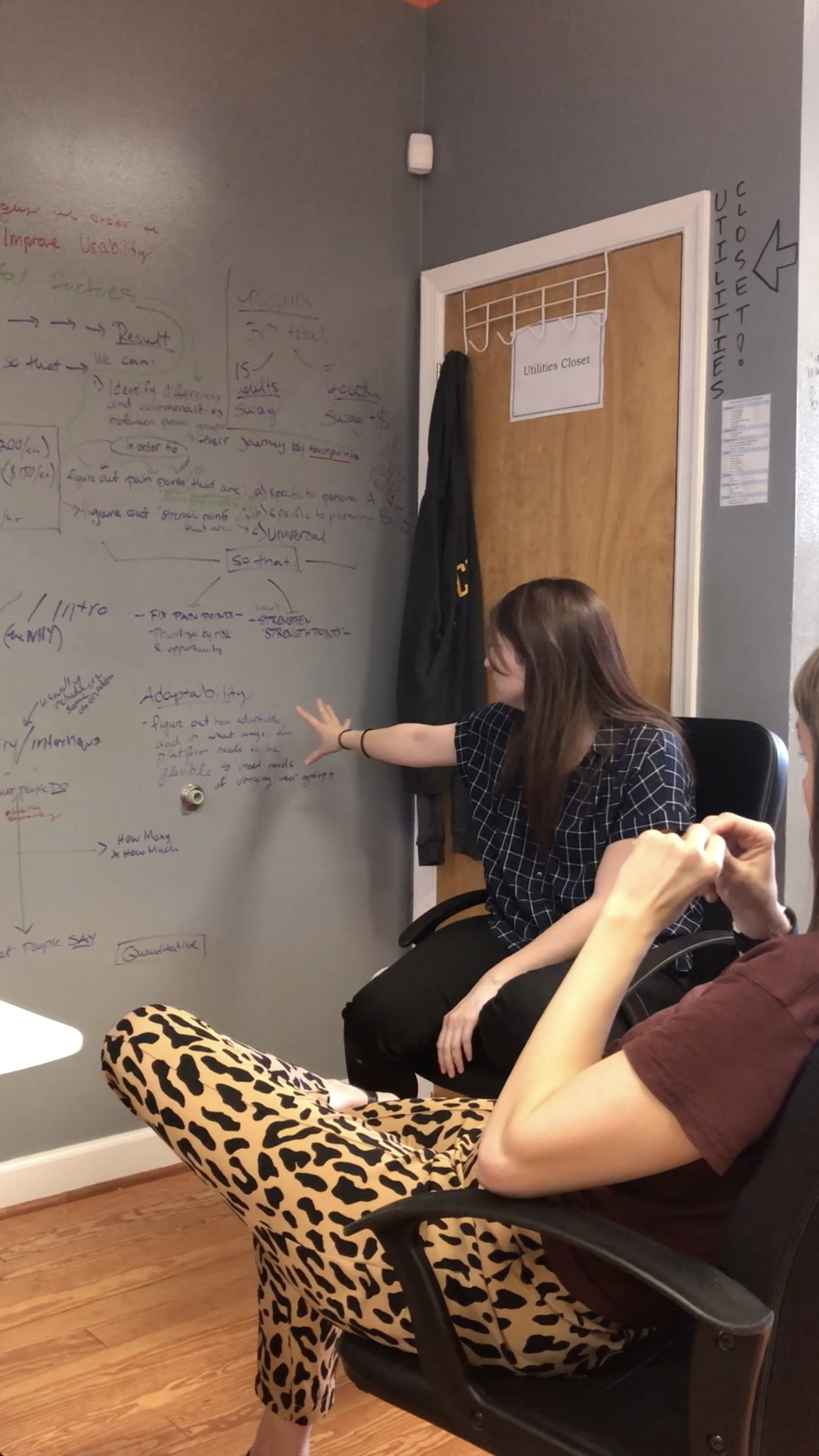
Aisha with cool pants on & me explaining my wall scribbles

Piece of the wall behind my desk
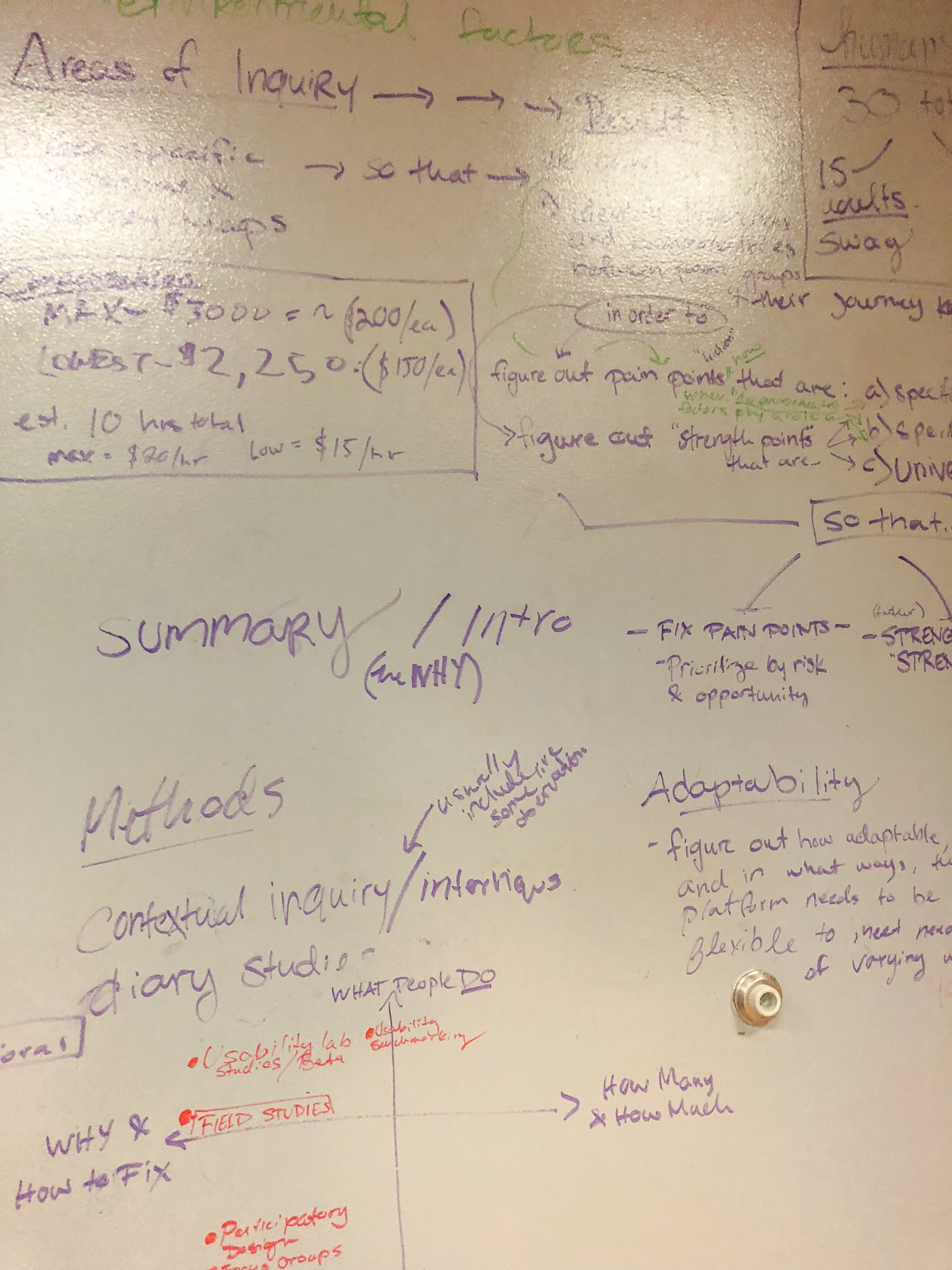
View from my desk after I mapped my thoughts on the wall behind me
Identifying Our Users
Youth participants had to be above the age-of-majority for their state (18 or 19), have an active cell phone that they would be able to use to download the Think of Us mobile app, and be engaged with a paid professional (case manager, social worker, coach, etc.) during the two week testing period.
Adult participants had to be paid professionals that would be engaged with one of the youth participants during the test period. Adult participants also tended to be social workers who had a positive, open attitude toward technology and testing new approaches in child welfare work.


Field Testing Plan Outline
The field testing would take place over a period of 14 days, and would consist of three phases:
#1 | Day 1: Onboarding Session
- TOU team and participants are on-site for a 60-minute onboarding session
- During onboarding session, participants are introduced to the Platform and team helps them set up profiles on their personal or work devices
#2 | Days 2 - 13: Field Test Period
- Youth and case workers use Platform as they go about their daily lives
- Automated text message campaign encourages participants to engage with Platform (Frequency: approx. 1 text message per day)
#3 | Day 14: Focus Groups/Interviews
- TOU team and participants return to on-site location for 90-minutes focus group
- During sessions, participants will give both verbal and written feedback detailing their experiences using the Platform
Talking to Users Part 1: Onboarding Sessions
For the initial onboarding sessions, our goal was to introduce participants to the study, get everyone signed up and connected with their teammate on the platform, and get them comfortable using the mobile app and web platform.
Our first onboarding session didn’t go exactly as planned—but not necessarily in a bad way.
Since this was the first time real users were setting up accounts and connecting with each other, they ran into issues. Some were bugs, some were usability issues, and some were a result of the platform still being in beta.
Because groups needed me to help them troubleshoot their sign up issues, we shifted gears from doing the planned presentation about features to working with groups individually to solve their specific sign up issues.
This unexpected change of plans with the Nebraska group allowed me to work more closely with participants as they went through the sign up process. This meant that I was able to observe their actions, get more detailed verbal feedback about the sign up process, and understand their reactions to errors, bugs, and usability barriers.
We were also able to take what we learned in Nebraska and pivot our onboarding plan for the Santa Clara group the following morning. Ultimately this strategy gave us more insight into what it actually looked like for users to sign up on the platform—all the different ways they might go about it—and what was important to our users during that step.


Talking to Users Part 2: Feedback Workshops
The feedback workshops were an opportunity to bring the groups back together after they had been using the platform in their daily lives for two weeks and get their feedback.
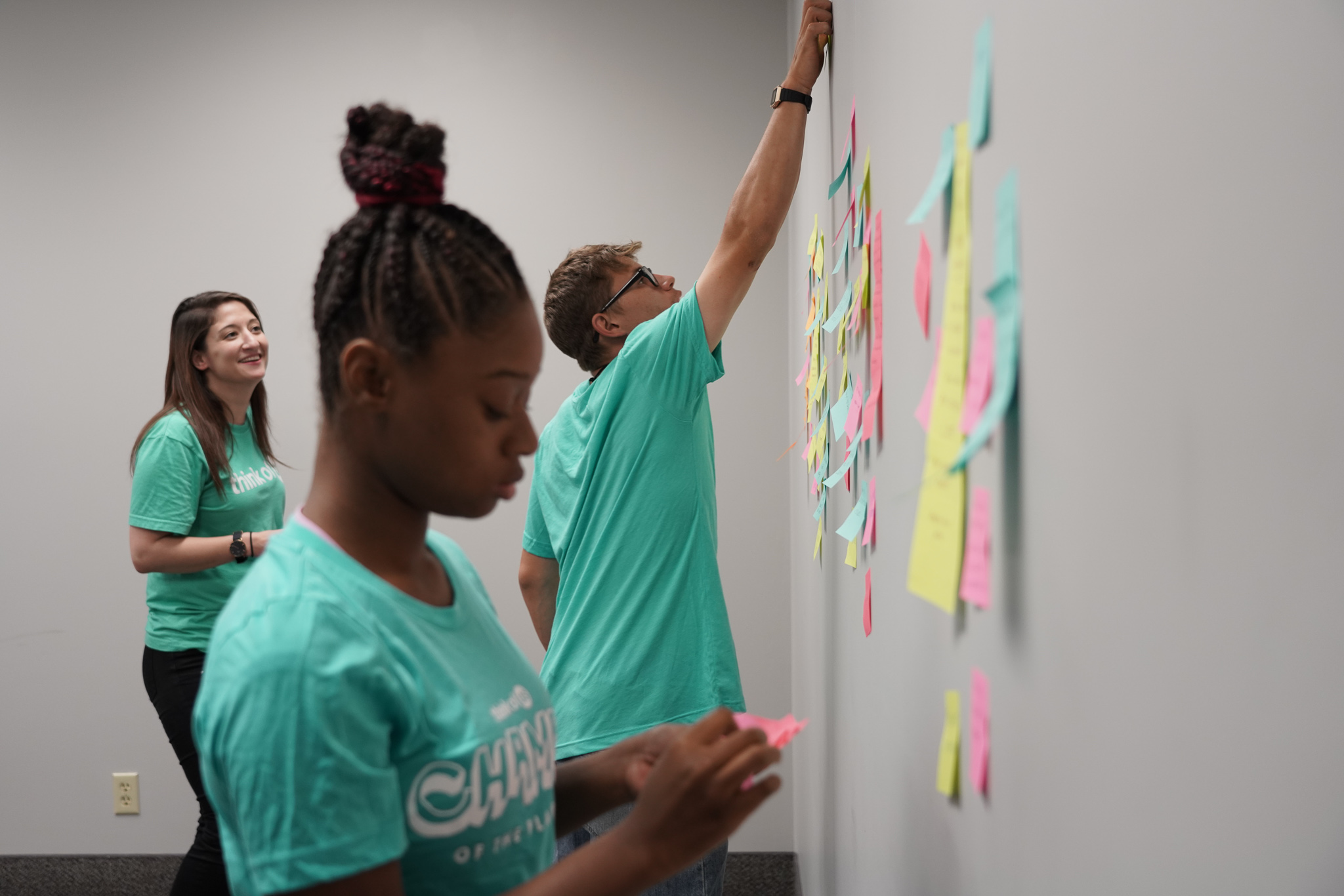
For the Nebraska group we were able to do the workshop in person, so I started the group with a content ideation warm-up (15-20 min) and then moved us into an affinity diagramming activity. I introduced three initial categories for participants to start to group their feedback and ideas by for the affinity grouping activity: Loves, things they loved; Issues, any issues they ran into; and Wish List, anything they would like to add, change or improve about the app.

Some of the post-it notes from the affinity diagramming activity, grouped under "Loves."
As we started the diagramming activity I realized that adding small group interviews, rather than relying on group discussion only, would give us more insight into users motivations and values driving their likes and dislikes.
I interviewed each team for about 15-20 minutes each, and I had them use their ideas from the affinity diagramming exercise as a starting off point. The interview setting gave each participant a chance to give context to the “why” behind their feedback—not just lettings us know that they liked a certain feature, but explaining why they liked it and why it provided value to them.
The more I spoke with and listened to each team I realized that really understanding this “why” was going to be key to creating a product that makes a difference in the lives of the people it was created for.


Finding Meaning in the Data
My process of synthesizing qualitative research starts with getting everything typed. To save time, I found an online tool called Temi—this was a lifesaver. I uploaded the audio files of each interview and it automatically transcribed each conversation and provided an interface for me to highlight and export key quotes.

I used Temi to transcribe and listen to the interview recordings.
Next, I wanted to give some structure to my analysis and identify the patterns that I was already noticing in the data.
To do this I used a qualitative data analysis method called coding that involves creating and assigning "codes" to pieces of data as you identify common themes. Using a qualitative analysis tool, Dovetail, allowed me to filter and compile my coded data and draw connections between emerging themes. Through this process I identified six key themes as most important to our users in relation to finding value in the product.

I used an app called Dovetail to tag and organize key themes.
Findings
The data told a story of why our users found value in the think of us platform. In piecing their stories together I found that there were five key principles driving the value of the Think of Us platform in our participants lives. We came to call these five principles our "Five Key User Values" that we would use as a guide to align solutions with user needs moving forward.
Five Key User Values
User Value #1: Personalization & Control
Features that provided personalization and control added significant value for users overall, and particularly for youth.
USER VALUE #2: Encouragement & Validation
Supporters and youth expressed appreciation for having multiple ways of providing encouragement and validation through social-like features on the Platform.
USER VALUE #3: Collaboration
Any feature that facilitated easier, faster, and more overall collaboration between supporters and youth was highly valued across the board.
USER VALUE #4: Accountability
Both supporters and youth participants liked features that ensure accountability on both sides. Each appreciated notifications and reminders that would help them hold themselves accountable, and liked knowing that the Platform would hold the other person accountable, too.
USER VALUE #5: Simplicity
Young people and supporters strongly valued the simplicity of having “everything in one place.”
"When you're in the foster care system sometimes you switch social workers a lot, and then you [would] add that supporter on there, but you don't know them. You don't necessarily want them to have your life story, even though it might be important. Then when you start to get to know them you can give them that access."
A young person explaining why they may want to add someone to the platform without giving them viewing permissions of the "My Story" section of their profile at first
"I like [being able to tell my story in my profile] because a lot of the youth are defined by labels and to be able to have a story to put to the name is a whole lot better."
Young person talking about the "My Story" section in user profiles
"Let's say Ally* set a goal. If I could give it a thumbs up or leave a comment, like, 'That's a really great goal. Let me know what I can do to help you get to that goal.'"
A case manager talking about ways she wanted to use the platform to provide additional support and encouragement for the young people she supports
"[The chatbot] was something that encouraged you, it was something like, you know, 'How's your day going?' That's something that a lot of people want to hear that a lot of people don't get asked by everyone."
Young person talking about the impact that the chatbot persona, Tyson, that greets youth every time they log into the platform
"So [if my case worker is notified when I set a goal] she can be like, 'Hey, I see you set a goal list, let's make a plan for this, you know, we can meet at the library or something.”"
Youth's reaction to her case worker requesting to be notified when she creates a new goal
"If you've got a youth that hasn't had any contact with a formal team in a couple of years and they're like, 'Oh, I just want to reach out to this person. I see Think of Us and I think I can probably reach out to somebody and they might be able to help me with this.'"
A social worker talking about how the Think of Us app could help youth reconnect when they need help from anyone in their network of supporters
"I feel like you should have something that reminds you, oh don't forget to do this on this day. That actually rings to your phone. Like an actual message notification, you know?"
Young person talking about the importance getting notifications and reminders to help keep her on top of her goal deadlines
"So this [would be] an easy way to keep [action plans] up to date with the system because I'll set a goal with them and I'll come back and be like, 'All right, how's your goal doing?' and they're like, 'Uh, I don't remember what it was.' So that's a way for them to always be accountable."
A case worker talking about the platform serving as a communication tool for youth to use as a reference for the goals case managers are already setting with them
"We really just love [...] that you can set goals, see ideas, resources, and all of that all in one place. That it's not just going to google for this, and facebook for this, and that for this, you know, there's so many ideas all together."
Social worker talking about how the platform has streamlined their scattered workflow
"I like that you can make a goals list on one set and it shows you all your goals. When you go on [the app] it goes right there so you can just see and be like, ‘Oh yeah, I didn't forget to do that. I have to remind myself to do that.’ You just see it."
Youth user talking about being able to see all of her goals as soon as she opens the mobile app
"When you're in the foster care system sometimes you switch social workers a lot, and then you [would] add that supporter on there, but you don't know them. You don't necessarily want them to have your life story, even though it might be important. Then when you start to get to know them you can give them that access."– A young person explaining why they may want to add someone to the platform without giving them viewing permissions of the "My Story" section of their profile at first
"I like [being able to tell my story in my profile] because a lot of the youth are defined by labels and to be able to have a story to put to the name is a whole lot better."– Young person talking about the "My Story" section in user profiles
"Let's say Ally* set a goal. If I could give it a thumbs up or leave a comment, like, 'That's a really great goal. Let me know what I can do to help you get to that goal.'"– A case manager talking about ways she wanted to use the platform to provide additional support and encouragement for the young people she supports
*Name changed
"[The chatbot] was something that encouraged you, it was something like, you know, 'How's your day going?' That's something that a lot of people want to hear that a lot of people don't get asked by everyone."– Young person talking about the impact that the chatbot persona, Tyson, that greets youth every time they log into the platform
"So [if my case worker is notified when I set a goal] she can be like, 'Hey, I see you set a goal list, let's make a plan for this, you know, we can meet at the library or something.”"– Youth's reaction to her case worker requesting to be notified when she creates a new goal
"If you've got a youth that hasn't had any contact with a formal team in a couple of years and they're like, 'Oh, I just want to reach out to this person. I see Think of Us and I think I can probably reach out to somebody and they might be able to help me with this.'"– A social worker talking about how the Think of Us app could help youth reconnect when they need help from anyone in their network of supporters
"I feel like you should have something that reminds you, oh don't forget to do this on this day. That actually rings to your phone. Like an actual message notification, you know?"– Young person talking about the importance getting notifications and reminders to help keep her on top of her goal deadlines
"So this [would be] an easy way to keep [action plans] up to date with the system because I'll set a goal with them and I'll come back and be like, 'All right, how's your goal doing?' and they're like, 'Uh, I don't remember what it was.' So that's a way for them to always be accountable."– A case worker talking about the platform serving as a communication tool for youth to use as a reference for the goals case managers are already setting with them
"We really just love [...] that you can set goals, see ideas, resources, and all of that all in one place. That it's not just going to google for this, and facebook for this, and that for this, you know, there's so many ideas all together."– Social worker talking about how the platform has streamlined their scattered workflow
"I like that you can make a goals list on one set and it shows you all your goals. When you go on [the app] it goes right there so you can just see and be like, ‘Oh yeah, I didn't forget to do that. I have to remind myself to do that.’ You just see it."– Youth user talking about being able to see all of her goals as soon as she opens the mobile app
Outcome
These findings allowed us to make improvements to the Think of Us platform in the coming months that were in-line with actual user values, and responded directly to user needs.
1. In addition to the values described above, I also identified 8 key usability issues and X bugs that needed to be addressed immediately
2. The 5 key user values and specific feedback from users helped us prioritize and validate the product roadmap.
3. The 5 key user values guided our design choices and implementation with our specific launch groups
1 - UX Improvements to Existing Interface
Through my own observations combined with user feedback I identified eight improvements to the existing user interface that we could implement immediately to improve user experience.
Some of these were incredibly simple, like this one:
Observation: In
Observation: In